Endless Gallery Template
A small template for big archives (and the quiet joy of not needing a framework for everything)
This text is not meant to be definitive. It's a diary entry about something I built, why I built it, and what it changed in my head. Read it as a snapshot, not a prescription. Take what resonates, leave what doesn't.
This isn't a new idea
There are already interfaces that treat visual archives as something you move through, not something you page through.
Public Work (by Cosmos) is a good example: minimal framing, continuous discovery, the work doing the talking.
And platforms like Are.na built an entire culture around collecting, ordering, and letting context accumulate over time.
Endless Gallery is a lightweight, standalone infinite scrolling gallery, a part of a wider "endless archive" pattern you'll recognize from projects like Public Work. Built in vanilla JavaScript with no frameworks, no build step, and zero dependencies.
Repo: GitHub Repository
The problem (which is barely a problem, until it is)
Every time I want to show work, I end up negotiating with the same invisible constraints:
- "Just upload it to a platform."
- "Just use a gallery plugin."
- "Just spin up a site builder."
- "Just… accept the defaults."
And sure: that works. Until it doesn't.
Because at some point, you're not "sharing images" anymore — you're accepting someone else's assumptions about how images should behave. Pagination. Feed logic. Compression. Cropping. UI choices that are fine until they quietly become the aesthetic.
So I built a gallery that does one thing, obsessively:
It never ends.
What "endless" means (in practice)
Not "infinite scroll" as in one long vertical tunnel.
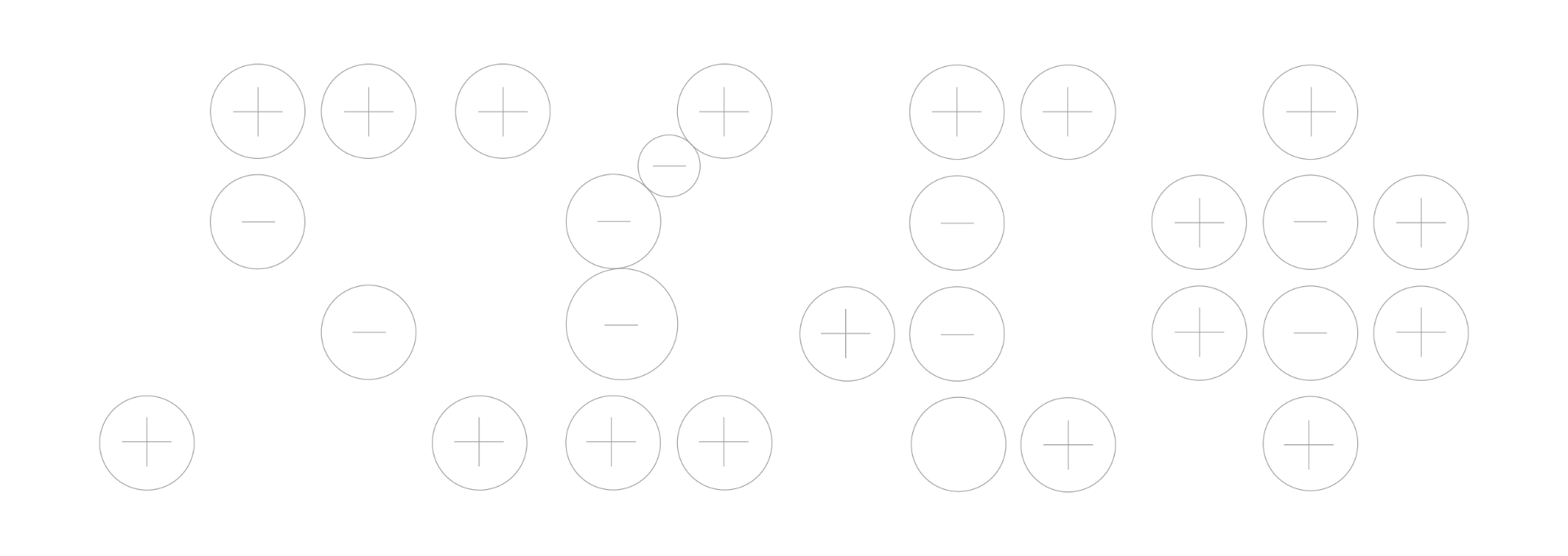
I mean bi-directional: horizontal and vertical. No edges. No "next page." You can scroll, drag, drift, re-orient, keep going.
The template ships with a bunch of things that are basically just… what you want when you're staring at images all day:
- bi-directional infinite scrolling (horizontal + vertical)
- click + drag navigation (grab / grabbing cursor)
- momentum scrolling with configurable friction (default is
0.95) - lazy loading via Intersection Observer + base64 thumbnail placeholders
- responsive columns (1–6 depending on breakpoints)
- video support (autoplay muted, pause out of view)
- accessibility basics (ARIA labels, keyboard navigation,
prefers-reduced-motion) - themeable via CSS custom properties
- performance-minded rendering (virtual scrolling, GPU transforms, CSS containment)
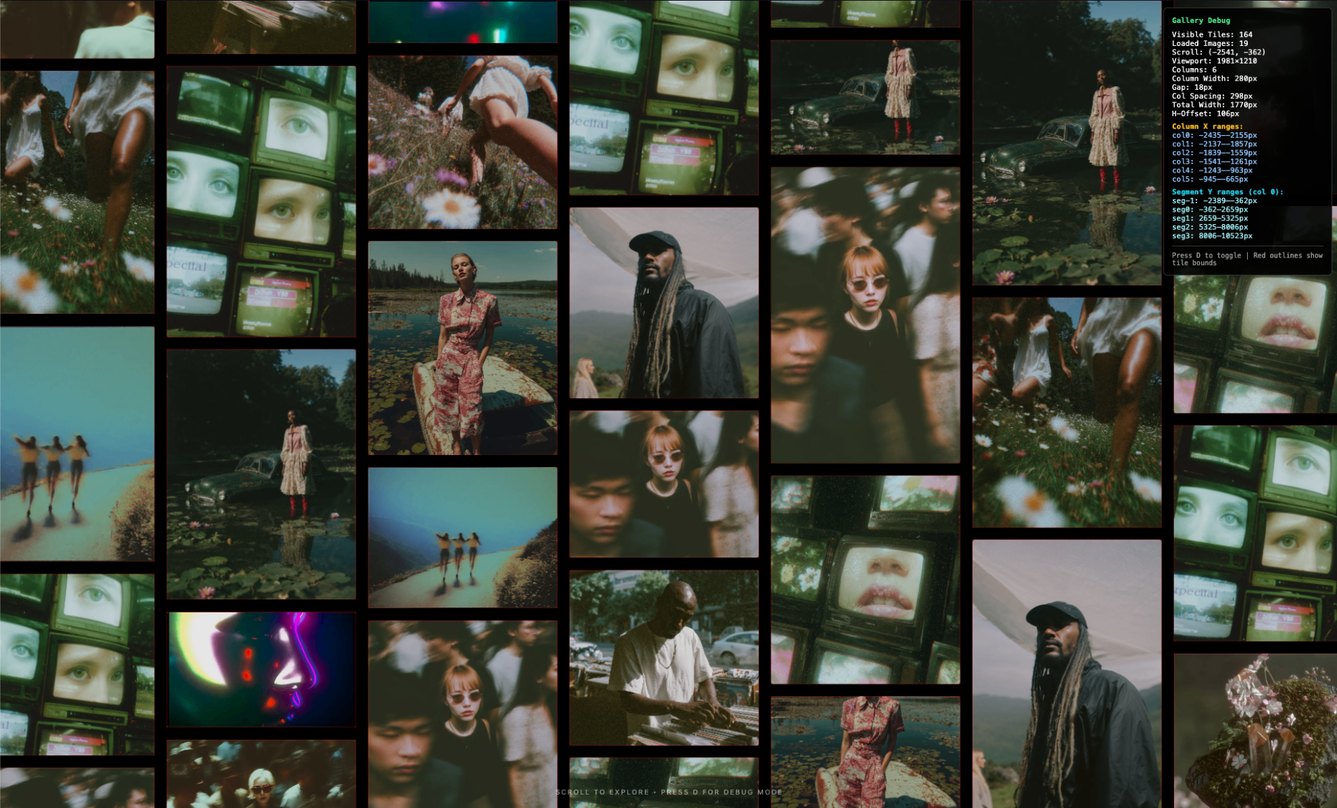
- debug mode: press
Dfor tile outlines, ranges, overlap checks
If you're reading that list and thinking "that's a lot for 'lightweight'", same.
But the point is: it's still just files you can open. No build step. No dependency archaeology.
Why I built it from scratch (on purpose)
I could've used an existing gallery framework. There are thousands.
But that would've meant inheriting assumptions I didn't agree with:
- how images get loaded
- how they're grouped
- how navigation should feel
- how much of the system you're allowed to touch
So I built it from scratch. Not because it's impressive, but because ownership starts there, at the level of structure, not styling.
This isn't anti-platform.
It's just me wanting a version that's ownable.
Quick start (no ceremony)
Clone it and serve it:
git clone https://github.com/A043-studios/Endless-Gallery-Template.git
cd Endless-Gallery-Template

# Python 3
python3 -m http.server 8000
Open:
http://localhost:8000Yes, you can open index.html directly.
No, browsers don't always love file:// + media. A local server keeps it boring (in the best way).
The two files you'll actually touch
1) js/config.js — how it moves
All settings live in js/config.js — no code changes needed.
A few knobs define the "feel":
columns,columnWidth,gap= densityresponsive.breakpoints= how it adaptsfriction,minVelocity= how long it glidespreloadCount,renderBuffer= how aggressive it is about performance
Example (trimmed):
columns: 5,
columnWidth: 280,
gap: 18,

responsive: {
  enabled: true,
  breakpoints: [
    { maxWidth: 640, columns: 1 },      // Mobile
    { maxWidth: 1024, columns: 3 },     // Tablet
    { maxWidth: 1440, columns: 4 },     // Small desktop
    { maxWidth: 1920, columns: 5 },     // Desktop
    { maxWidth: Infinity, columns: 6 }  // Ultra-wide
  ]
},

friction: 0.95,
preloadCount: 20,
renderBuffer: 2000
That friction value is a tiny thing that changes the whole vibe.
Raise it and the gallery feels heavier, more cinematic. Lower it and it becomes more "tool."
2) js/media-manifest.js — what it shows
You add your media by editing a simple array: MEDIA_ITEMS.
const MEDIA_ITEMS = [
  {
    id: "my-photo-1",
    src: "path/to/photo.jpg",
    type: "image",
    aspectRatio: 1.5    // height / width ratio hint
  },
  {
    id: "my-video-1",
    src: "path/to/video.mp4",
    type: "video",
    poster: "path/to/poster.webp",
    aspectRatio: 1.0
  }
];
Then point mediaPath in config.js to wherever your files live:
mediaPath: "./my-media-folder/"That's it. You're not "uploading into a system."
You're declaring files.
If you want it fast, treat images like a system too
The template supports srcset + tiny base64 placeholders, which is the difference between "smooth archive" and "why is my laptop screaming."
Example:
{
  id: "my-photo-1",
  src: "uploads/my-photo.jpg",
  type: "image",
  srcset: "optimized/my-photo-280w.webp 280w, optimized/my-photo-560w.webp 560w",
  thumbnail: "data:image/webp;base64,...",  // Tiny placeholder
  aspectRatio: 1.5
}
The boring (useful) rules:
- use WebP if you can
- generate a few sizes (e.g. 280 / 560 / 840)
- keep the small ones actually small
- tune
renderBufferandpreloadCountdown on mobile - if you're hosting a lot, set
mediaPathto a CDN
Debug mode (because reality happens)
Press D and it flips into debug mode: tile outlines, column/segment ranges, overlap checks.
I like anything that turns "looks wrong" into "here's the actual constraint."
Styling without touching the engine
Theme changes live in CSS variables (css/theme.css).
So if you want "white cube gallery" or "black void archive" or "soft grey editorial," you're not rebuilding UI components, you're changing a few values.
Example (trimmed):
:root {
  --gallery-bg: #000000;
  --gallery-text-color: rgba(255,255,255,0.5);
  --gallery-loading-bg: #1a1a1a;
  --gallery-item-opacity: 0.9;
}
Separation matters:
- visuals are art direction
- motion is interaction design
- neither needs a build step
Why it's MIT
MIT license is not a manifesto. It's just a practical statement:
Take it. Fork it. Break it. Remix it. Ship it.
Make it weird.
If someone turns this into something unrecognizable, good. That's the point.
Closing thought
Galleries are not neutral. They shape what feels "finished," what feels like "process," what disappears, what gets to stay visible.
Endless Gallery is my attempt to keep the interface quiet and the archive alive.
A small system that doesn't ask for permission to grow.
And yes, it's also just fun to drag a wall of work into motion and let it glide.